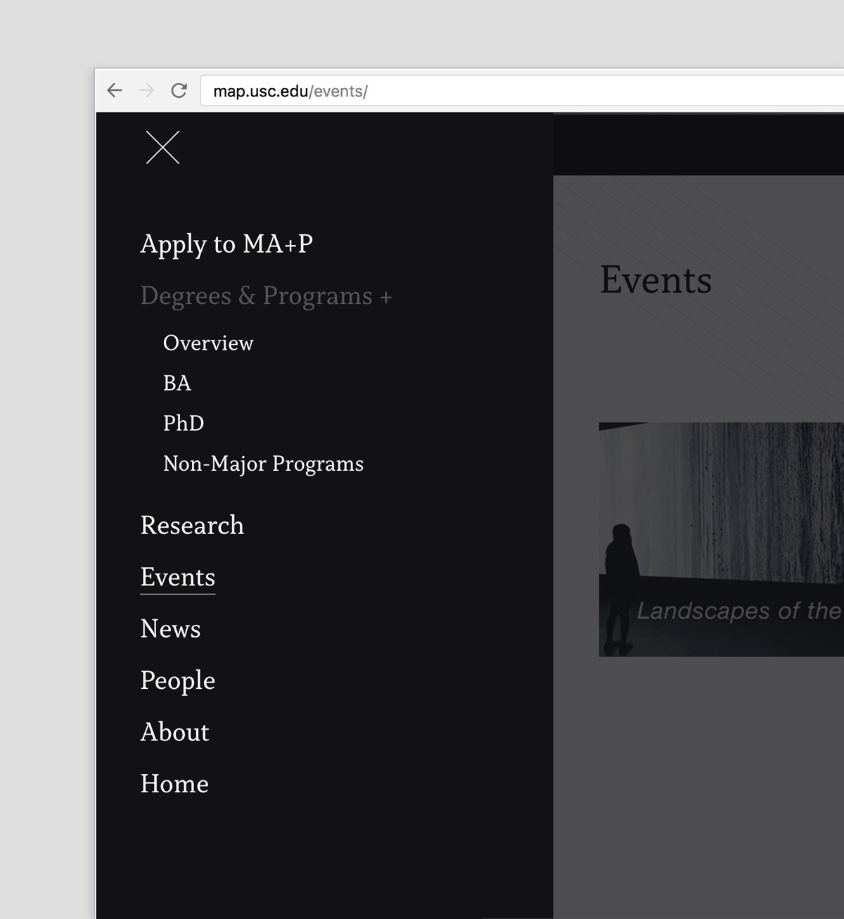
A visual system composed of typography and color was created for the Media Arts + Practice division in the USC School of Cinematic Arts. The system is used for the print and web design of the program.
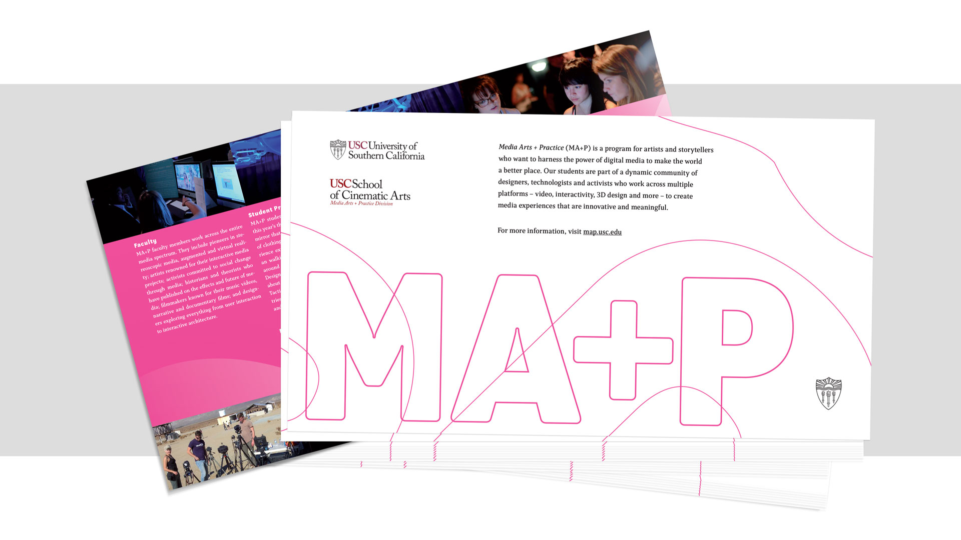
MA+P


Letterforms are used as a visual motif by enlarging specimens of the Program OT typeface.

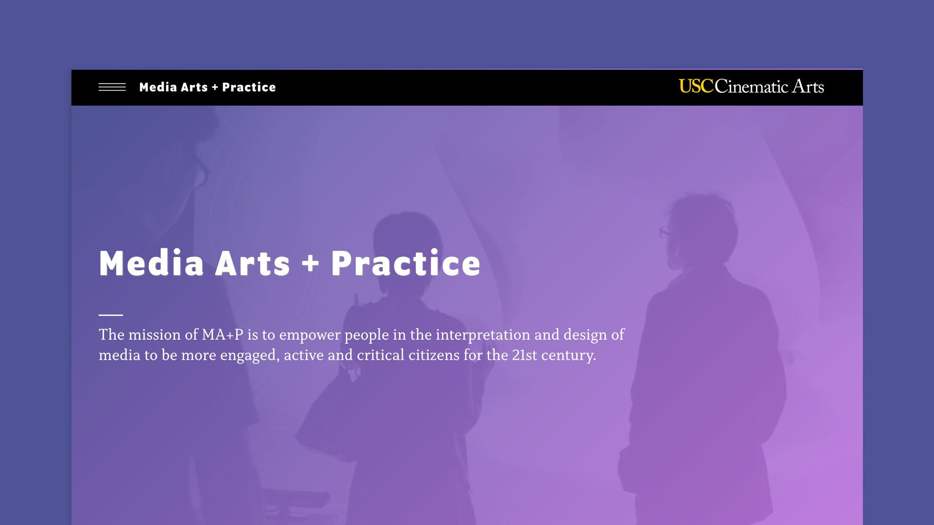
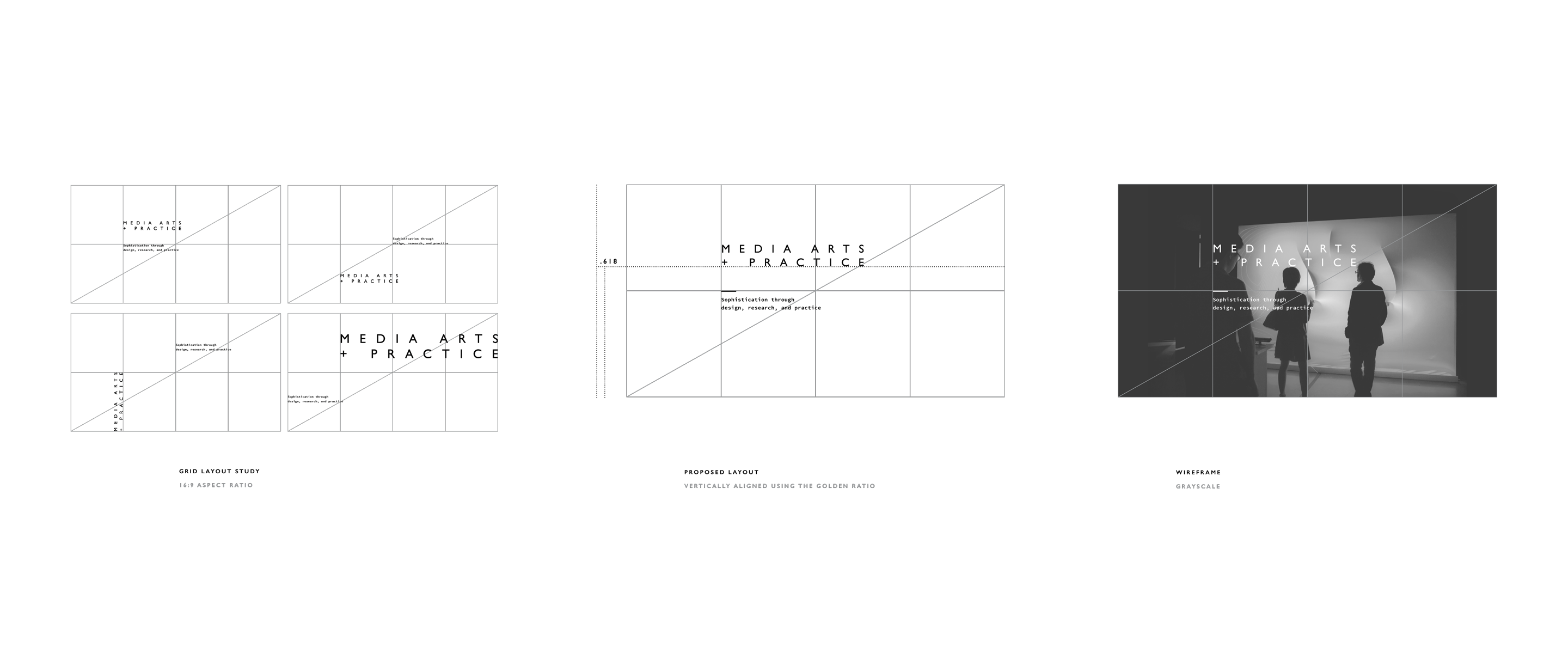
A grid layout study – first done in grayscale – proposes an ideal ratio for the banner image and headline on the website home page.
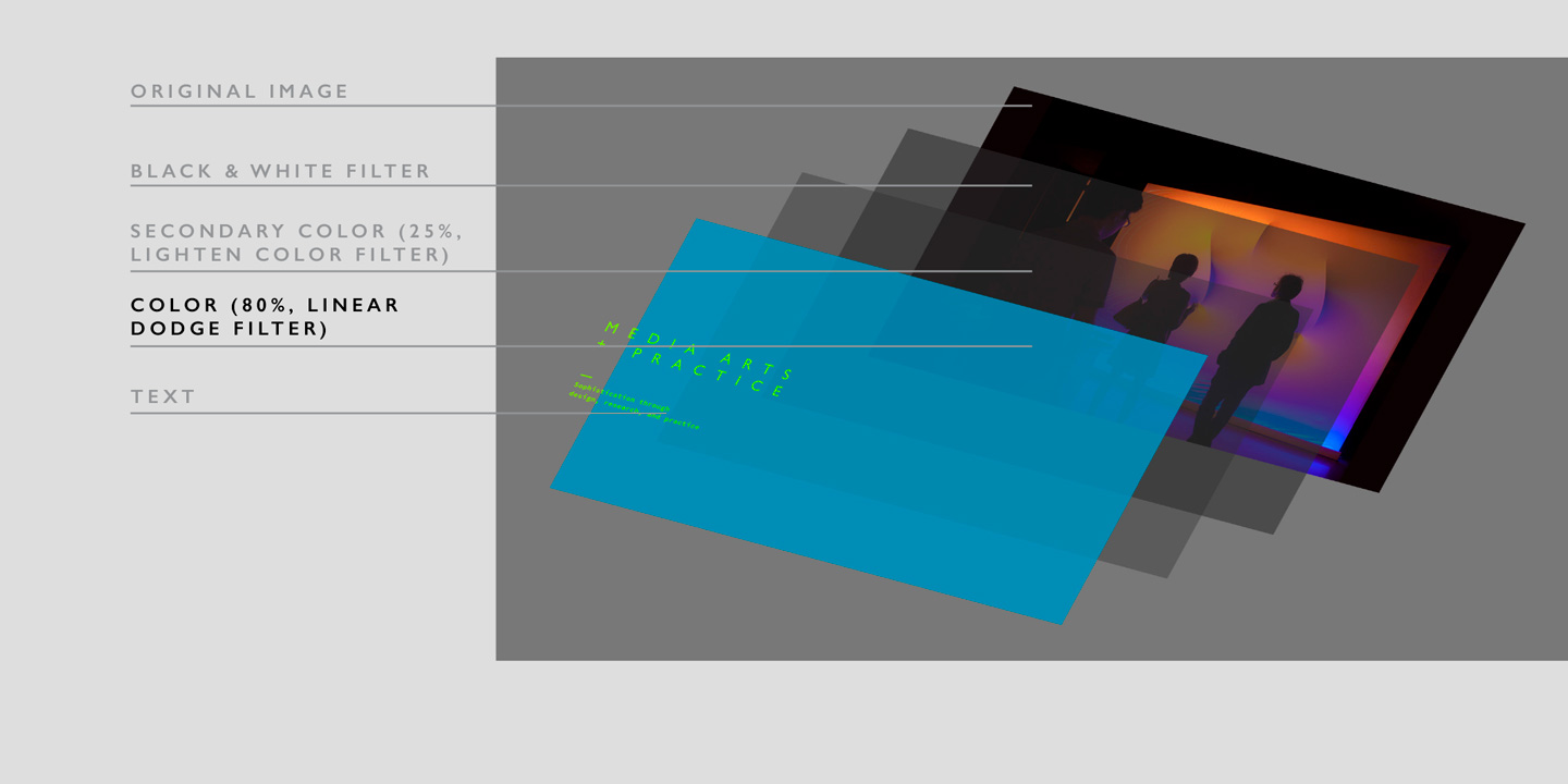
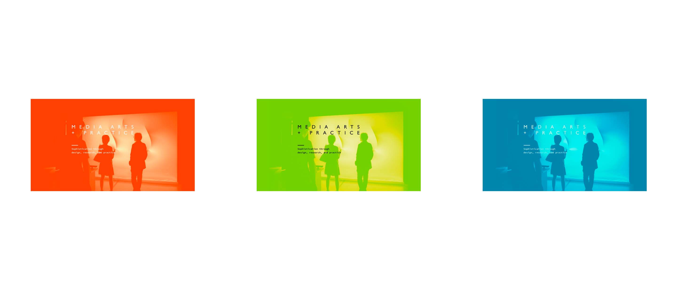
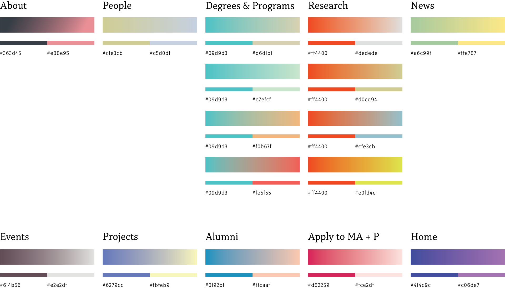
A refined color palette uses gradients. Gradients allow for more combinations in addition to variations within a shared base color. For example, certain pages (e.g. Degrees & Programs) contain subcategories and thus share a base color to maintain consistency.